
UX/UI audit of the Promesse de Fleurs site
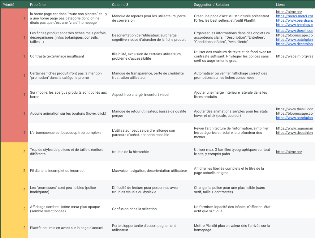

Challenge
The site, created in 2008 and enhanced over time without a complete overhaul, presented significant constraints: complex structure, information overload, and degraded visual consistency. The analysis had to cover a catalog of over 25,000 products, a dense blog, and multiple languages. The main challenge was therefore to create a clear and prioritized diagnosis in a vast and technically constrained digital environment.
Goal
The goal was to propose true improvements to make navigation smoother, enhance ergonomics, and strengthen graphic coherence. The audit was intended to serve as a basis for a potential redesign, identifying priority bottlenecks and illustrating possible solutions through mockups and prototypes.
Results
The final audit, summarized in a comprehensive report, prioritized the UX issues according to their severity and formulated specific recommendations. The document was presented to the internal team and praised for its clarity and method. This work enhanced my skills in UX/UI analysis and visual communication, while highlighting the technical limitations of the company (few developer resources).